ChiBrations Case Study
The performing arts world is a dynamic ecosystem, brimming with talent, creativity, and a constant need for connection and visibility. ChiBrations, a forthcoming artist-led media platform designed to be the central hub for performing artists, celebrating their work and encouraging a thriving community.
2024
Year
2 months
Duration
Mobile Aplication
Category
Figma | Figjam
Stack
Objectives & Goals
- Redesign a user-friendly and responsive interface that meets accessibility and modern UI standards. - Maintain Client’s UX and task flows to ensure consistency with the previous version.
Product Users
- Both emerging and established performers are looking for exposure and community. - Individuals interested in discovering new talent and enjoying diverse performances.
The current user interface (UI) for ChiBrations' platform started as a functional MVP (Minimum Viable Product). While it successfully launched the core features, it now lacks the user-friendliness, responsiveness, and accessibility features that today's users expect. This creates a barrier for some users and hinders the overall user experience (UX). The UI's design also falls short of modern standards, potentially impacting brand perception.
The solution will be revamping the UI to address these limitations. The new design must prioritise user needs by being intuitive and adhering to accessibility standards to ensure inclusivity. However, achieving this transformation requires careful consideration to maintain the established UX and task flows. Users that are familiar with the previous MVP version should still find a smooth and consistent experience in the redesigned UI.

An online survey was conducted and after analysing the data, we discovered the following:
Below is our discovery after conducting analysing the data gathered
of respondents found it difficult to find suitable performance opportunities.
Insights from interviews revealed a strong preference for a platform that:
- Provides a searchable directory of performance venues and opportunities. - Offers tools and resources for promoting gigs and marketing artist content. - Features a community forum or chat function for connecting with other artists. - Curates artist profiles and showcases high-quality work. - Acts as a hub for artist resources, workshops, and grant opportunities.
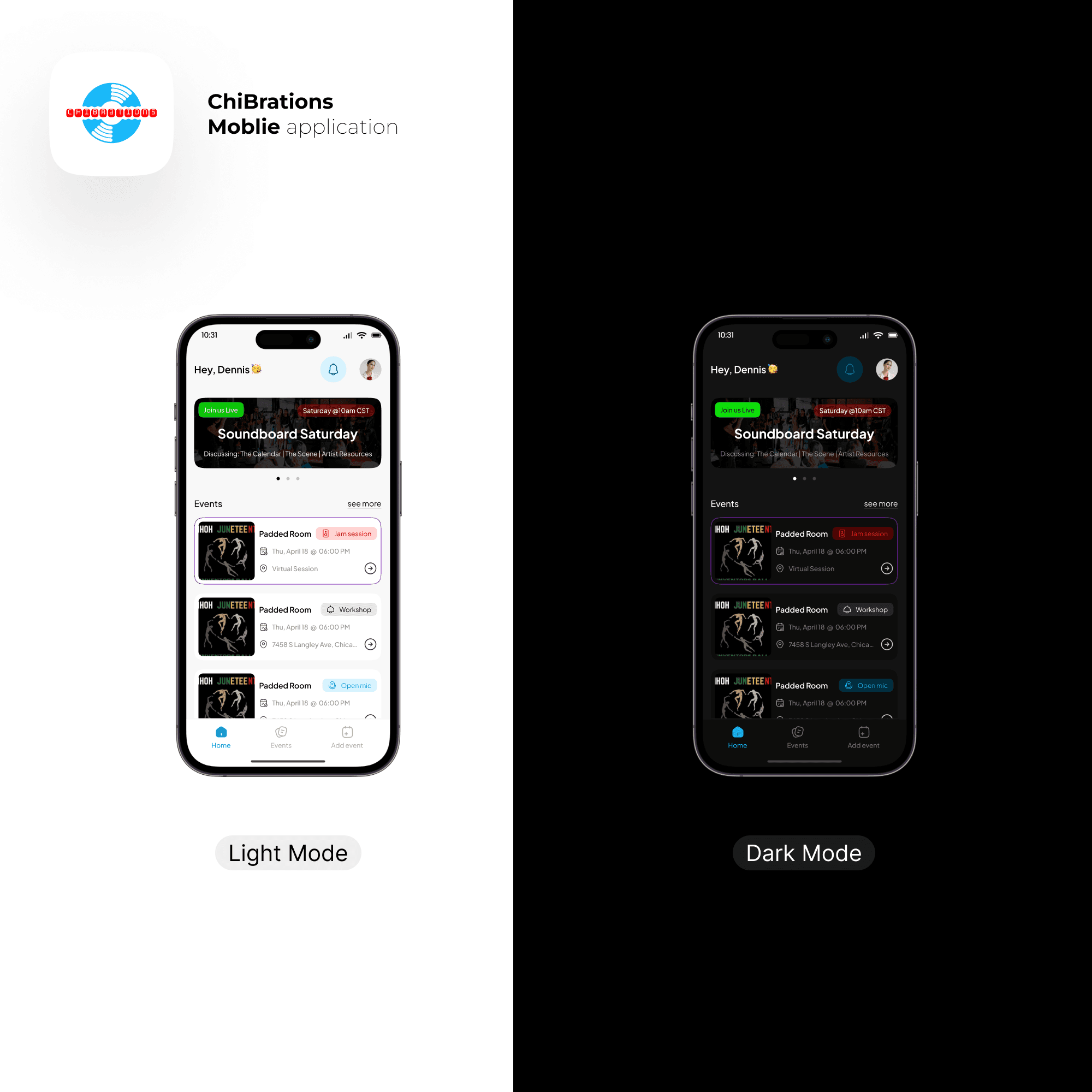
ChiBrations Application (Before)

Project Revamp
The revamp of Chibrations Mobile focuses on improving the user interface (UI) and Experience (UX) of an existing product, the UI was completely redesigned to be user-friendly, accessible, and visually modern. This ensures a smooth transition for existing users while creating a more inclusive and engaging experience for everyone.

Successful Migration, Integration and build up of application
For the design, wireframing, and prototyping phases, I utilized Figma. To streamline research, information architecture, and user mapping, I employed Figjam. The application was developed using FlutterFlow, a platform enabling the creation of beautiful, user-friendly apps for both iOS and Android while prioritizing accessibility. For the backend, we integrated with Supabase, a powerful BaaS solution offering numerous advantages: open-source flexibility, a robust PostgreSQL database for complex queries, real-time data updates, user authentication features, and unlimited cloud storage.

Integration of Geo-Locators
During the implementation phase, we successfully integrated a location feature within the application. After conducting my research, this enhancement discovered that it allows users to pinpoint the exact location of any given event easily. By providing precise location information, I aim to significantly improve the user experience, making it convenient for individuals to find and attend events of interest. (Reference from research I conducted; Kortum, P., & Dieterich, J. (2016). The impact of location-based services on user experience: A review of current research. International Journal of Human-Computer Interaction, 32(1), 1-18.)

Simplified and Clear User guide
Due to some of the changes I made during the revamp of this product, interface and experience-wise, I wanted to ensure the interface was intuitive and easy to understand. To achieve this, I focused on designing with clear affordances. For example, buttons were designed with clear visual cues to indicate their function. Additionally, I implemented an interactive tutorial accessible upon user sign-up to guide new users through the key interface elements and their functions, ensuring a smoother onboarding experience. (Reference; Don Norman's "The Design of Everyday Things")

Usable and accessible form user interface
Recognizing that complex forms can cause user stress and frustration, I designed an intuitive and accessible interface with a clear and concise flow. This user-friendly design guides users through each step of the process, minimizing confusion and ensuring a smooth and enjoyable experience. (Research; Nielsen, J. (1993). Usability engineering. Academic Press.)


Expanded sign-in options
I included additional sign-up and sign-in options such as Google and Apple to make the onboarding process easier and more efficient.

Accessible, Usable and a User centred Admin interface
We made the admin application, it’s features, actions and navigations as user centred as possible following best practices

The result
My contributions to these projects demonstrate a strong focus on user experience and accessibility. I designed a multiple viewing system that empowers users with customization options, aligning with Shneiderman's (1998) emphasis on user-centered design. I also created intuitive and accessible forms that minimize user stress, guided by Nielsen's (1993) usability principles. Furthermore, I prioritized intuitive interface design by implementing clear affordances and an interactive tutorial, ensuring a smooth onboarding experience. By leveraging tools like Figma and Figjam, I streamlined the design and development process, ultimately creating user-friendly applications that meet the diverse needs and preferences of our users.